Charts are often inaccessible to a student with visual impairments. This page offers some practical tips for modifying charts with some specific examples.
Presentation
- Clear black outlines on chart
- Bold used to highlight the chart headings
- Print and font adapted to child’s print specification
- Chart left aligned
- Text well spaced within each section of the chart
- Reduce visual demand
- Amount of data reduced whilst still assessing ability to interpret data
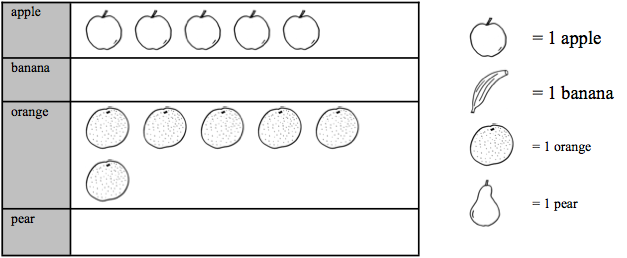
- Pictorial information replaced with text or basic symbols Chart/graph style changed to simpler format
- If child drawing chart, set up blank table, with printed headings
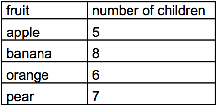
A. Example of Mainstream Chart
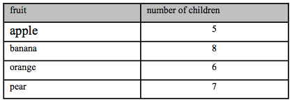
Class 1 did a survey of their favorite fruits, here are the results in a chart
Complete the chart to show the number of pears and bananas
B. Example of Modified Version
Class one did a survey of their favorite fruits.
The table to the left shows the results.
Complete the chart to show the number of bananas and the number of pears.
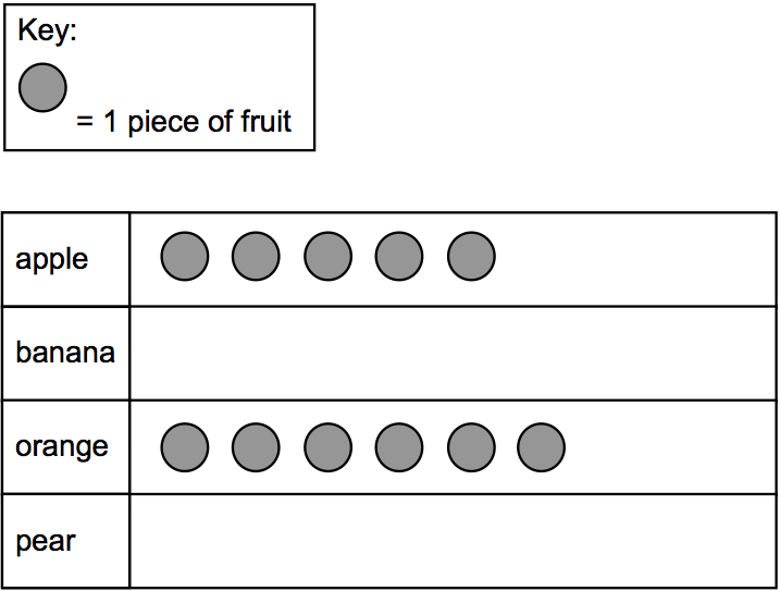
Principles of modification
- The question assesses pupils’ ability to interpret data.
- The modified version retains this assessment whilst reducing the visual demand
- The shading is removed from the table and the text left aligned
- The pictogram symbols are replaced with a single, simple symbol The key is moved above the pictogram
- The font size is enlarged to 18 point ( or to child’s print size)
- The font type is changed to Arial (or to child’s preferred font)
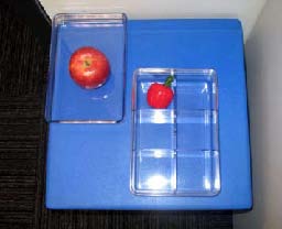
- Pupils who are unable to draw a symbol could indicate the number of
- symbols by writing numbers or instructing an amanuensis.
B. Example of Chart, Mainstream Version

This diagram shows the average monthly rainfall in the UK for 2005.
1. Approximately what is the average monthly rainfall for April?
____________________

1. What is the average monthly rainfall for April?
____________________
2. In which month is the average rainfall greatest?
_____________________
Principles of modification
The question assesses pupils’ ability to interpret graphs. The modified version retains this assessment whilst reducing the visual demand.
- The radar chart is replaced with a line graph
- The amount of data is reduced to present five months in place of twelve
- months
- The data point for April is changed to enable pupils to read a point on a grid line
- The answer boxes are replaced with answer lines
- The font size is enlarged to 18 point
- The font type is changed to Arial