Skip to content
Activity and strategy

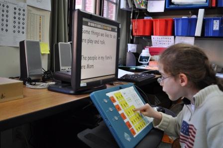
Using Large Print

American Foundation for the Blind shares tips to make print more readable for individuals with visual impairment

These guidelines from Vision Aware include suggestions to make print more legible for individuals with vision problems and for the general public as well.  They include tips for the following areas:

  • print size
  • font type and style
  • use of color
  • contrast
  • paper quality
  • leading
  • tracking
  • margins


SHARE THIS ARTICLE
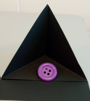
Black easel construction highlighting a large, purple button.
Blog

CVI High Contrast Instructional Easel Template

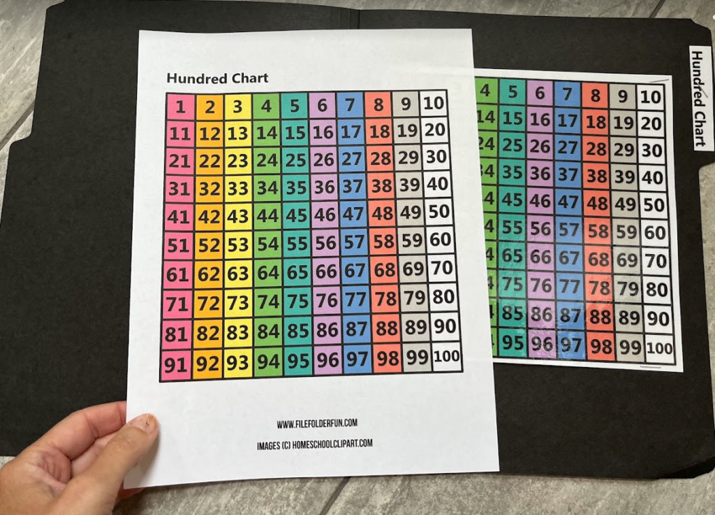
hundred chart with colored columns that fits in a file folder
Activity and strategy

File Folder Learning for the Blind and Visually Impaired

Blog

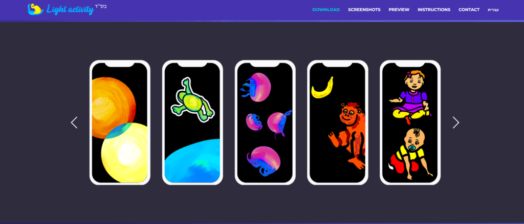
Light Activity App to Improve Visual Functions