“Don’t go in for the ‘yellowish’ if what you need is ‘yellow’. The attitude called precision is the quality that remarks the accuracy of your demand. Never settle for the less; Go for the exact thing!”
― Israelmore Ayivor, (writer) The Great Hand Book of Quotes
The other day when sitting in a meeting, the principal of the school and I were talking about what a difference certain colors make when helping children with disabilities to see print better when reading.
I began explaining how my student with Usher’s Syndrome prefers the colors yellow and black when doing classwork. Not just one child, but three of my students have preferred the colors yellow and black.
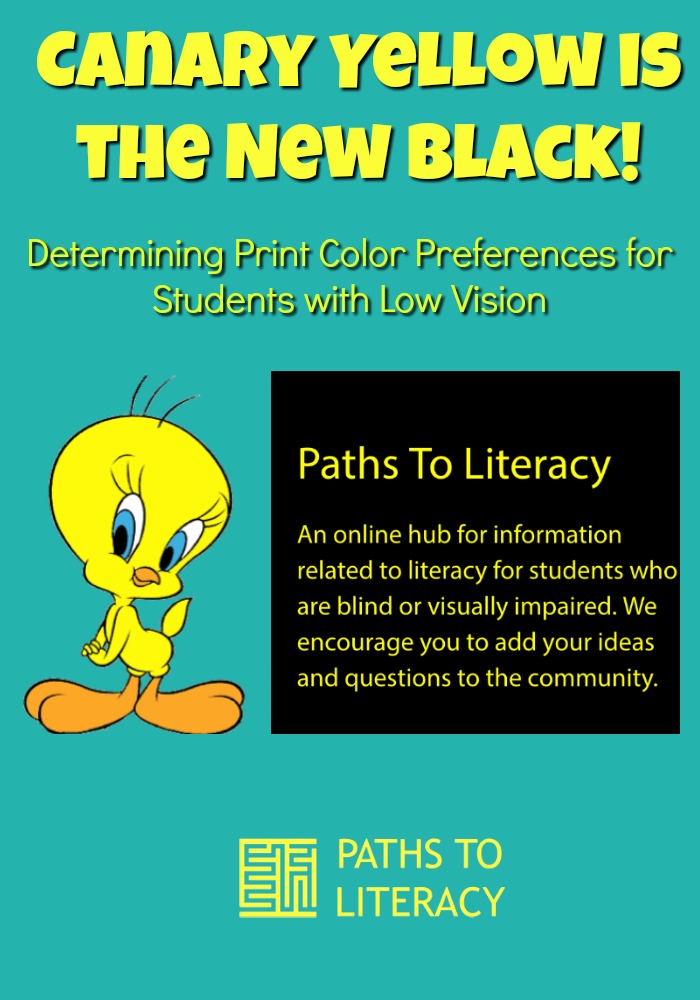
The principal became interested and asked, “Is it a black background with yellow writing or a yellow background with black print? Also, is it pale or a canary yellow?”
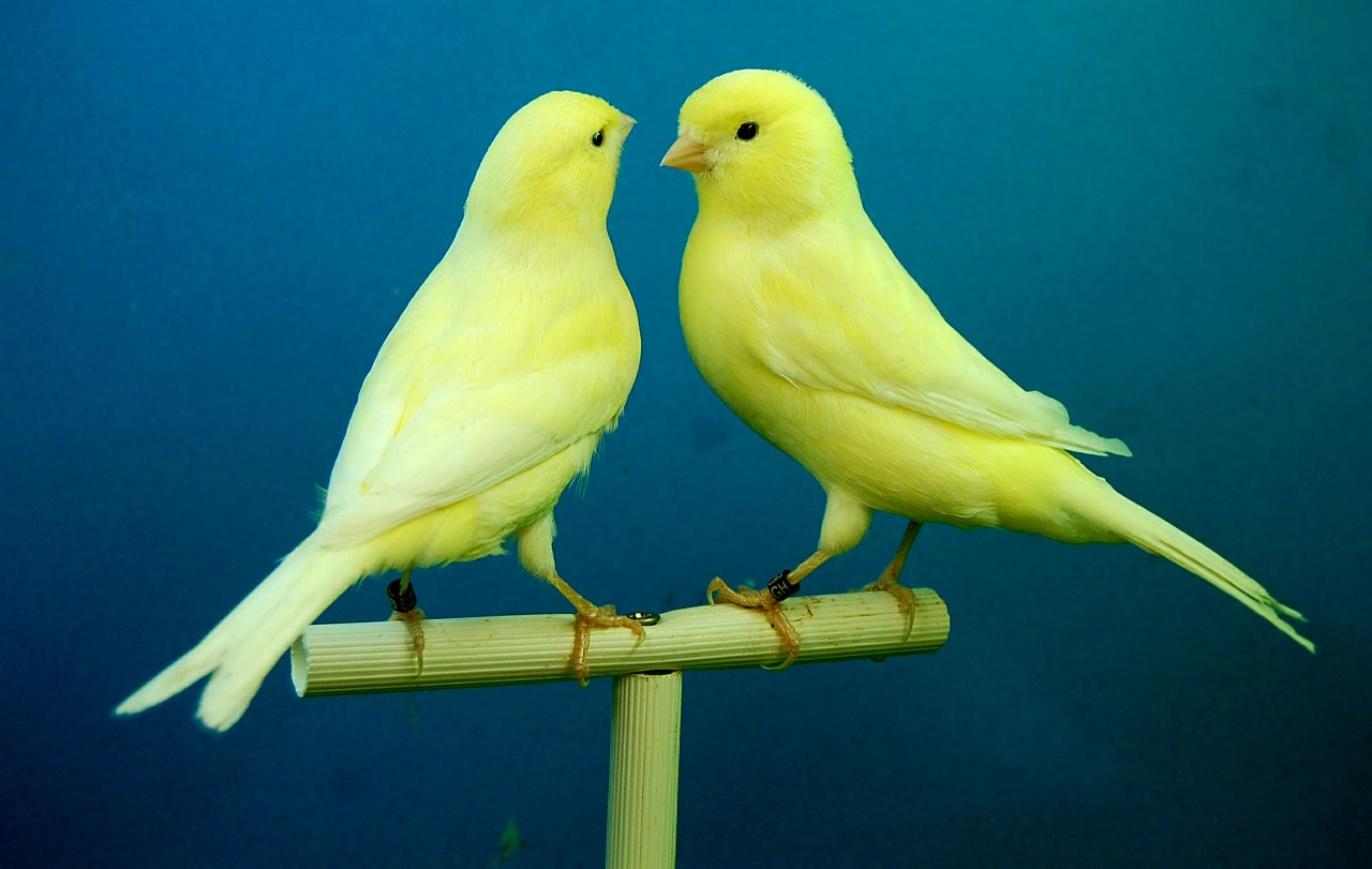
I loved her questions and how she concretely stated “canary yellow”. I began answering her questions and realized how much I learn from so many educators, parents, other specialists and my students as they force me to really think about small details that could make a huge difference. As a person who is extremely random and sees the whole picture and struggles with detail, I was grateful for a person who is concrete in nature and looks for the smallest of details.

When giving one of my students the almighty STAAR test (a mandatory achievement test in Texas), she began asking for a certain font size and then stated, “I like the black in the back and yellow writing.” I immediately changed the background of the test to accommodate her needs and watch a struggling reader really read and understand the passages from the test.
While she preferred the black background with yellow writing, my other student with Usher’s preferred the canary yellow background with black print. He once said when asked that yellow is the color helped him to see best. However, he restated that what he truly meant was a high contrast yellow — canary yellow.
I began to think of Walt Disney’s words (one of my favorite men in history who also had a disability) “There is no magic in magic. It’s all in the details”.
So many times when I am in a hurry, I forget to ask my students with low vision to be exact about the colors he or she prefers when reading print. They, too, will quickly answer, “I don’t know or I guess white is okay as long as the light isn’t shining down on the paper.”
Disney was correct when he stated that it’s all in the details– the smallest of detail makes a huge difference in how a child learns and understands his world.
The simple conversation with the principal (lasting less than three minutes) has made a huge difference in my way of thinking about accommodating my students within the classroom.
I try to simply take a few minutes with each child really watching for the small details that will make the biggest impact. If I show the student samples, find out his/her likes and dislikes, I will know how to help educators, specialists and family members teach — really teach — our children with low vision.
Like writer Israelmore Ayivor once said, “Don’t go in for the ‘yellowish’ if what you need is ‘yellow’. The attitude called precision is the quality that remarks the accuracy of your demand. Never settle for the less; Go for the exact thing!”
And as far as three of my low vision students are concerned, yellow is the new cool way of seeing print!
Yes, canary yellow has definitely become the new black when teaching children with low vision.