After finishing 4 tactile pieces for the Portland Art Museum in 2023, I had the opportunity to create 2 additional tactile pieces for traveling exhibitions visiting the museum in 2024 and 2025. The first piece I worked with was Paul McCartney’s “Self-Portrait. London, 1963” from his photo exhibition, “Eyes of the Storm”. I was so thrilled to have the opportunity to work with this wonderful piece, and the unique challenges it offered helped me develop new techniques to create even more engaging 3D tactile graphics.
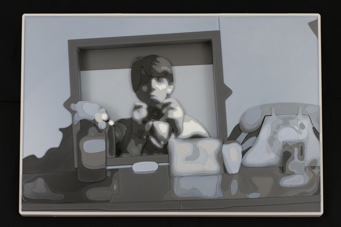
The original image is a fuzzy landscape of a dresser in a dimly lit room, strewn with everyday items. At the center is a slightly blurry Paul McCartney, holding up a camera to snap his own photo in the mirror. Confusing reflections scatter across the dresser’s surface, making it difficult to see where objects begin and end. In the mirror, the left side of Paul’s face is obscured by a heavy shadow, and you can just make out the subtle part in his iconic mop-top haircut.
As I started designing my 3D tactile graphic, I began with some promising techniques from past projects. I varied the height of key items in the scene, like the phone, bottle, vase, and box, so they could be readily located. I carefully adjusted the height of each item to help convey its position in the scene. For example, the phone sits behind a small vase and box on its left, and a small photo rests on top of the phone’s dial at its center. Each key feature has additional details to be explored by the reader, some bold and some subtle. For the rippled reflections on the dresser’s surface, I used a barely perceptible texture. The subtlety of the texture helps to imitate the ambiguity of the reflections, and provides the reader with just a bit more information without drawing too much attention to itself or becoming a distraction to the larger piece. The combination of these techniques helped to pull together the elements of the dresser scene quite nicely.
But the photo’s centerpiece offered the biggest challenge. How do you transcribe a reflection? How do you signal to the reader that this area of the graphic is somehow separated from the rest of the dresser scene? How do you guide the reader to find the central focus of this image?
My solution was to leave a great big hole at the center of my piece. As readers explore the dresser’s surface and its collected items, they will inevitably find a large absence at the center of the graphic. By reaching down into the opening, readers will find Paul McCartney, holding up his camera to snap a photo.
This approach neatly solved the challenges I had with the reflection. The sunken area helps to convey the depth that the reflection adds to this dresser scene. By lowering the reflection deep into the background, I’m signaling to the reader that there is something exceptional about this area of the image, separating it from the dresser scene above. The opening itself is a point of curiosity, enticing the reader to explore what may be missing, and guiding them to the image’s focal point in a memorable way.

With these key design choices sorted, I had just a few pesky practicalities left to address. Here are some of the novel approaches I used to pull all the loose ends into a final piece.
- Large format: Thanks to new hardware and some creative stitching, this piece is my largest* to date, at roughly 29 inches by 19 inches. The large size helps improve the legibility of the individual elements. (*I made a bigger map)
- Grayscale printing: I want my tactile pieces to be engaging for the widest audience possible, so I try to color match pieces to their originals the best I can. Color matching with 3D printers is nasty business, but I developed a technique that allowed me to print 16 different shades of gray in order to closely match the colors in the original photo.
- Separating tactile and visual presentations: With more new hardware and some quirky tricks, I can now completely separate my tactile and visual presentations. This is great for creating visually rich pieces without all the tactile clutter. In this piece, there are some features you can see but can’t feel, and some features you can feel but can’t see. Each presentation is optimized for its intended audience.
- Enhanced layering: There are layers of key features in this piece to help guide readers to important elements. Those key features also contain their own layers to help readers interpret important details. For the tactile of Paul’s reflection, the tallest layer is the circle of his camera lens. Slightly behind that, Paul’s fingers wrap around the camera’s body, which is held in front of his face. You can feel where the cuffs of Paul’s shirt rest just above his wrists, and where the camera strap dangles behind his arms and in front of his chest. There’s a slight separation between the lit and shadowed sides of Paul’s face, with his mop-top sitting proudly above, and a small tuft of hair peeking out from behind his ear.

After a couple months of constant planning and incessant day dreaming, I slowly assembled the final piece in my small basement workspace. The end result is a tactile collage that offers touch-readers a chance to explore this beautiful piece in great detail. After a decade of exploring this 3D tactile approach, I’m still so excited about its potential to make rich and beautiful tactile graphics that can provide greater access to complex content for blind audiences.
I hope this piece will be enjoyed by all, and I hope that it will spark conversations about art, museum access, and the future of tactile graphics.
Keep Reading: A Beginner’s Guide to 3D Printing for TSVIs