The following tips sheet is aimed at offering short, clear guidance to class teachers regarding print media access for children and young people with visual impairment. Each child’s access is individual and a careful and thorough assessment of their vision and preferred access methods is required at the outset, with regular and ongoing review to ensure their needs don’t change. I refer to this part of the child’s identification of need as their Print Specification.
The following is offered as good practice guidelines.
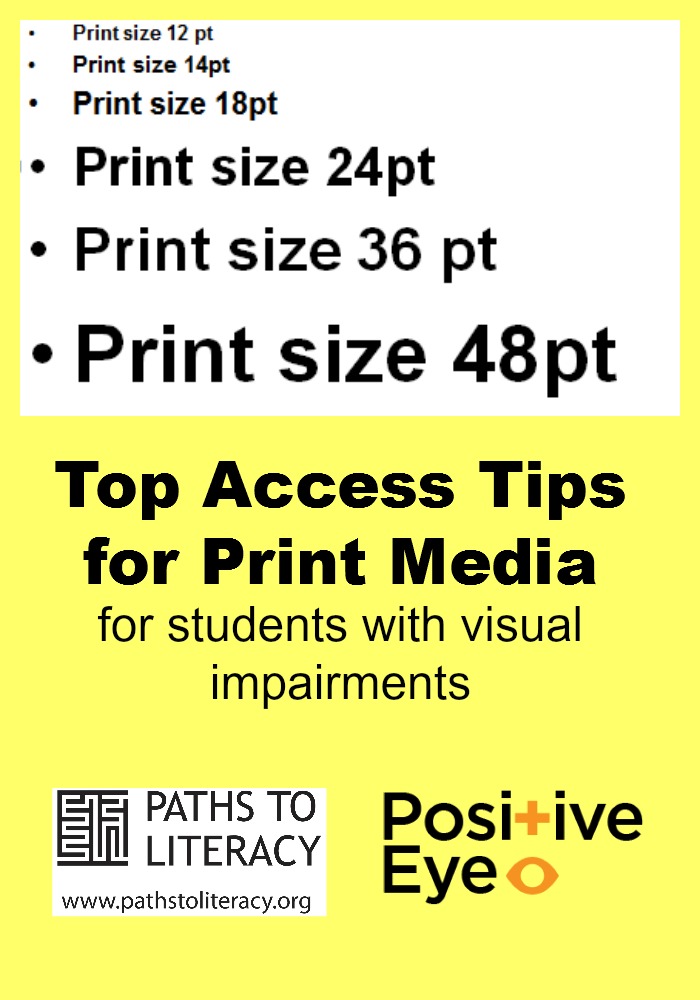
1. Print size
- Present text at assessed print size
- Use same print size for all text
2. Typeface
- Use same Typeface to present all text
- Present text in assessed typeface (font), e.g. Arial, Comic Sans (Sans Serif)
3. Type Weight
- As a general rule: Use plain text for main body of text and bold for emphasis.
4. Type Style
- Avoid Italics and prolonged use of capitals
- Avoid underlining
5. Line Spacing
- Single or 1.5 to 2 lines between one line and the next
6. Contrast
- Use black ink on good quality white paper
- Occasionally a child may prefer a different colour paper, but this will depend on individual need
7. Paper quality
- Choose matte papers ideally weighing over 90gsm (Photocopying paper usually weighs 80gsm)
8. Design and layout
- Keep layout simple and uncluttered
- Reduce amount of text/graphics on page
- Change orientation of page to accommodate larger text
- Remove additional text/graphical information that are unnecessary
- Present pictures and diagrams on opposite pages to the text
- Margins wide enough to be hole punched without running through the text
9. Page numbers
- Decide on position of page number, keep this consistent for all work
- Decide on page numbering, e.g. In line with book adapted
10. Learning objective
Consider the learning objective or task to be completed. Are there any adaptations/reductions that can be made to:
- Amount of content?
- Number of questions to be answered?
Finally –
Minimise the amount of curriculum materials the child has to access whilst ensuring they can achieve their learning objectives and have maximum opportunity for success.
Avoid!
Enlarging materials onto A3 paper using the photocopier because:
- Print, font, layout, contrast does not match the child’s required print specification
- Doubles the size of the paper to scan from
- Accessing text and graphics on A3 for most children exacerbates the existing visual difficulty and should be avoided!
There are more Top Access Tips sheets on Positive Eye’s website. Email:gwyn@positiveeye.co.uk